Part 2 My Logo Design

The popularity of Helvetica, and its imitator Arial, has reached epidemic proportions. It’s just used as the default option. This thoughtlessness is more an abstention from the “font” vote than a love for it. Helvetica’s virtues are thought to be transparent, neutral, emotionless, an easy choice, and mistake-free. And this kind of inaction “correct” is only based on the fact that “the font itself does not convey information”. But is it true that fonts do not convey content properly? Or is the design and selection of fonts more complex and difficult to master than color, spacing, or placement?
David Carson, whose work is eclectic, says “don’t confuse” readability “with” delivery “. Just because something is readable doesn’t mean it communicates the message, and more importantly, it doesn’t mean it communicates the message correctly. On the other hand, something that is difficult to read at first may convey a completely different message and is worth the reader’s time to engage with.” In the digital world, the concept of handwriting has gradually disappeared. It is difficult for people to express their feelings and personality through their handwriting. For designers who are most concerned with individuality and hate similarity, it is undoubtedly a pity if they do not cherish the opportunity to carefully choose the right typeface.
Stefan Sagmeister (whose graffiti on his body has been circulated all over the country’s BBS) gives a vivid summary of the modern design that Helvetica represents: “I am utterly disappointed with modernism in the general sense. They’re so boring! We got a handbook and they all had a lot of white space, a few lines of Helvetica type, an abstract little LOGO at the bottom, a picture of a business person walking… This shit is so boring.”
Thankfully, the director has kept all of these arguments in place, but the tribute remains a rhetorical eulogy of Helvetica: nonsymmetric typefaces are modern, rational, and brief, but serif typefaces are actually better to read; To conceptually equate serif fonts with Helvetica, skim over and even ignore other serif fonts such as Akzidenz-Grotesk, Din, Univers; Highlight the popularity of logos, utilities, and street-side stores as a design success. Lars Muller, the author of Helvetica, takes this adulation to embarrassing heights by repeatedly pointing out a Helvetica passage in the street.
All in all, it’s still a very comfortable movie to watch: well-made, with plenty of top designers on hand. Helvetica itself is a good font, and it’s only because it’s used too much that it becomes a problem.
Ok. Let’s talk more about my Logo design and branding typeface. Last week, I have some iterations around a 3D logo which conveys both my initials and my background of product design interest on making furniture.
I got some feedbacks and I decided to go with this idea.
- I like the color palette, It is playful and shows your personality
- You can adjust the shading of the logo
- think about how to fill the color
- extend the leg, make it more furniture looking
Based on my revision, This is my Final brand sheet. I choose Lato for my typeface because I think it goes well with my logo and my portfolio style.

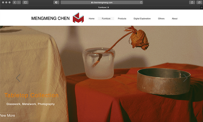
After the brand sheet. I put my logo on different media, packaging, cup, and my portfolio website.


Reflection:
Overall, I and satisfied with how it looks in the end and how it present in different media. If I have more time, I could try to render more like monochrome, metallic, or black and white versions.
See My work here:
https://drive.google.com/drive/folders/1E2zIX65jzMwYxIaYRdcrQrjykxnPml-v
